
Change Blog Title Size for Mobile Only on Squarespace
When you’re optimising your Squarespace website for mobile users, one of the things you might want to do is change the blog title size.
Just because you want to change it on mobile though doesn’t mean you want to change it on desktop too.
Well the good news is that you CAN change your blog title size on mobile only, you just need a little bit of code to help you out.
Watch the video
Check out the YouTube video below 👇

Want a framework for designing the perfect homepage?
Navigate to your blog and switch to mobile view. Open up Google Developer Tools (Shift + Command + C) and find the block ID for your blog title.
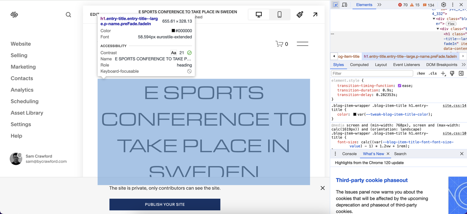
Once you have the ID, head to Website > Website Tools > Custom CSS and paste in that ID along with the following custom code:
.blog-item-wrapper .blog-item-title h1.entry-title {
font-size: 20px;
}
You then need to wrap all of this in media tags to tell Squarespace that this is only to target mobile screen sizes:
@media screen and (max-width: 640px) {
.blog-item-wrapper .blog-item-title h1.entry-title {
font-size: 20px;
}
}

Once you’ve done that, hit save and you’ll have changed the blog title size on mobile only.

Need an expert to build your Squarespace website?
Book a free kick-off call with our team to discuss your project requirements in detail.