
Remove mobile menu underline whilst using flex animation
In this article, you’ll learn how to remove that strange mobile menu underline whilst using flex animation - no fluff, just what you need to know. If you find the article useful, feel free to share it with the world using the social sharing icons on this page. Thank you!

1. Why use this code?
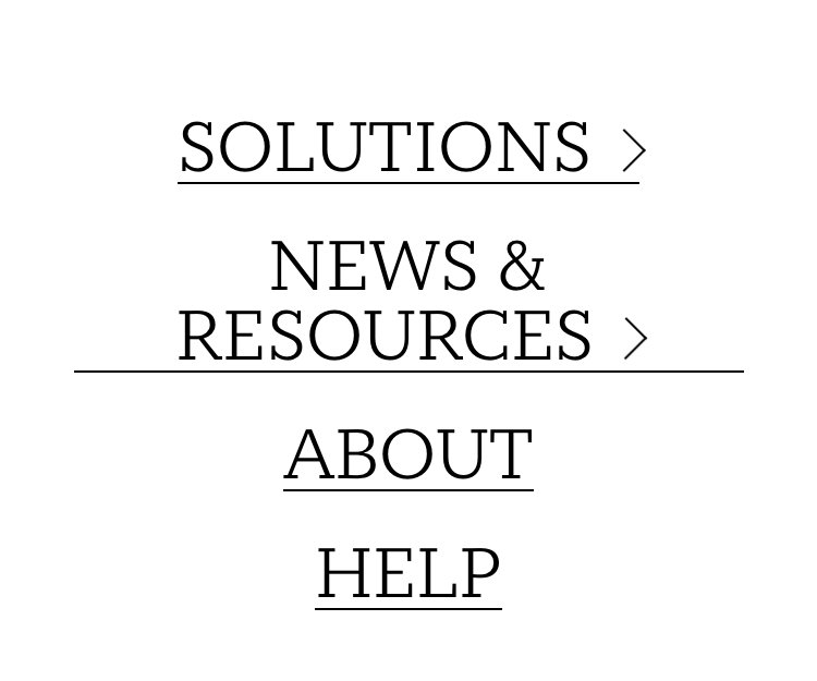
Flex animation on Squarespace is by far the best native option they offer. But it does create some strange glitches. Chief amongst them being the strange strikethrough effect on the mobile navigation menu. See below for en example of the pesky little blighter.
📩 Join the inner circle to get exclusive code updates
2. The code
Paste where? Design > Custom CSS
// Get rid of stupid line on mobile menu //
.header-menu-nav-item *{
background-image: none !important
}
3. Your designer
I'm Sam, an award-winning Squarespace web designer. I have worked with every type of business, building platforms for solo entrepreneurs through to multi-million dollar corporations. If you want to discuss a potential project, you can email on sam@bycrawford.com or get in touch with me here. Alternatively, you can book in a free 15-minute consultation call here.
Want more?


![How to Create a Blog on Squarespace [2024 Updated Guide]](https://images.squarespace-cdn.com/content/v1/5f53b4dad693da2d34e4e397/1714717173513-VJRULO4YYKAH3K8G62CS/image-asset.jpeg)
![How to Create a Squarespace Video Gallery [2024 Guide]](https://images.squarespace-cdn.com/content/v1/5f53b4dad693da2d34e4e397/1714675731827-UFKWVTWFOSNM49TZXS5B/image-asset.jpeg)
![Hide Header and Footer on One Page Only on Squarespace [NO-CODE UPDATE]](https://images.squarespace-cdn.com/content/v1/5f53b4dad693da2d34e4e397/1714216709774-JISY11KWQP798EX0JQNQ/image-asset.jpeg)


![How to Hide a Page on Squarespace [2024 Step-by-Step Guide]](https://images.squarespace-cdn.com/content/v1/5f53b4dad693da2d34e4e397/1714718816812-VG7Q54ICWO439K3FNHSN/image-asset.jpeg)


![Squarespace Contact Forms UPDATE [New Features Released]](https://images.squarespace-cdn.com/content/v1/5f53b4dad693da2d34e4e397/1712484570192-AUWBT0LE3G5Q45UF7BCZ/image-asset.jpeg)

![Add a Vertical Line to a Page on Squarespace [Easy Code]](https://images.squarespace-cdn.com/content/v1/5f53b4dad693da2d34e4e397/1711553569468-Y5OR2YS3HSLAYUEALVG6/image-asset.jpeg)


![[NEW FEATURE] Add Paywall to a Squarespace Blog](https://images.squarespace-cdn.com/content/v1/5f53b4dad693da2d34e4e397/1711129428606-83ZUXS4NUKQE0QGXDSUT/image-asset.jpeg)
![How to Show a Different Image on Hover [Squarespace Code Tutorial]](https://images.squarespace-cdn.com/content/v1/5f53b4dad693da2d34e4e397/1711129257275-P3IEYMXRMEW1O69KDWK3/image-asset.jpeg)
![Search Entire Squarespace Dashboard [Keyboard Trick]](https://images.squarespace-cdn.com/content/v1/5f53b4dad693da2d34e4e397/1711129068323-GBKXEUZYA7TF56LN5UQB/image-asset.jpeg)
 Sam Crawford
This article was written by Sam Crawford, one of the world’s leading Squarespace website designers.
Sam is an official Squarespace Expert, official Squarespace Partner, official Squarespace Community Leader, official Squarespace blog contributor, official Squarespace panelist, Squarespace educator and multi-award winning Squarespace designer.